

09: Context Matters — Why Your Perfect Message Fails on Phones
Design for Clarity (part 3 of 5)

🎧 Prefer Audio?
Here’s a human-recorded audio version with Chief Voice Officer Kirk McDavitt. Hit play, or keep reading below.
Where We Are
Last week, we talked about visual hierarchy and how it controls how people experience the messages we write and send.
This week, let’s dig deeper into something that undermines even the best-designed message: context.
Your head of school sends an urgent update at 4:47 PM.
You’re in the grocery store parking lot. Kids are arguing in the backseat. You open the email on your phone.
A spreadsheet. Seventeen columns. Font size: microscopic.
You pinch. You zoom. You scroll sideways trying to follow a single row across your screen. You accidentally tap a link. You’re now on a different website. You navigate back. The email reloads at the top.
The kids are now physically fighting. You give up.
Three days later, you’re in a meeting where everyone’s discussing the urgent changes. Everyone except you, because you never actually read past column three.
Sound familiar?
You’ve probably sent the exact same type of email.
The Great Context Disconnect
We have a fundamental mismatch in schools. We create communications in one context (seated, focused, large screen, quiet office) but they’re consumed in completely different contexts (standing, distracted, small screen, complete chaos).
It’s like preparing a gourmet meal and serving it on a roller coaster.
The Interaction Design Foundation calls this “context-aware design”—creating communications that work not in ideal conditions, but in the actual conditions where they’ll be encountered.
And those actual conditions? They’re messier than we want to admit.
The Mobile Majority Reality Check
Let me share some numbers that should fundamentally change how you create every piece of school communication:
Between 50-60% of email opens come from mobile devices in 2024. Not eventually. First. Almost 60% of people check their emails first thing in the morning on their phones.
Researchers found that average attention spans on screens dropped from two-and-a-half minutes in 2004 to just 47 seconds by 2020. That’s total. For everything they do on that screen.
Our lived experience in schools allows us to affirm that parents overwhelmingly check school communications on mobile devices first, not desktop computers.
We’re designing for the exception, not the rule.
The Three Contexts That Control Comprehension
Over my 15+ years in international schools, I’ve observed my fair share of community members interacting with school communications. That’s students, parents, staff and administrators.
I’ve identified three context factors that determine whether your message gets through:
Context Factor 1: The Device Dictatorship
Phone readers see 30-50 characters per line in portrait mode. They scroll vertically. They tap, not click.
Tablet readers see 50-80 characters per line depending on orientation. They might be in portrait or landscape. They’re often multitasking with other apps.
Desktop readers see 60-75 characters per line in well-designed emails. They have multiple tabs open. They’re probably at work.
Same message, three completely different experiences.
Context Factor 2: The Attention Competition
The average American checks their phone 205 times a day according to this recent article by reviews.org. Mobile readers aren’t just reading on a smaller screen; they’re reading on a device literally designed to interrupt them.
While reading your email, the average phone user receives:
2-3 notifications from other apps
1-2 text messages
Multiple badge updates
Possibly an actual phone call
Your carefully crafted message is competing with their entire digital life.
Context Factor 3: The Environmental Reality
Desktop reading happens in relatively controlled environments. Mobile reading happens while walking, while watching TV, and in transit.
You’re not competing for attention: you’re competing for attention fragments.
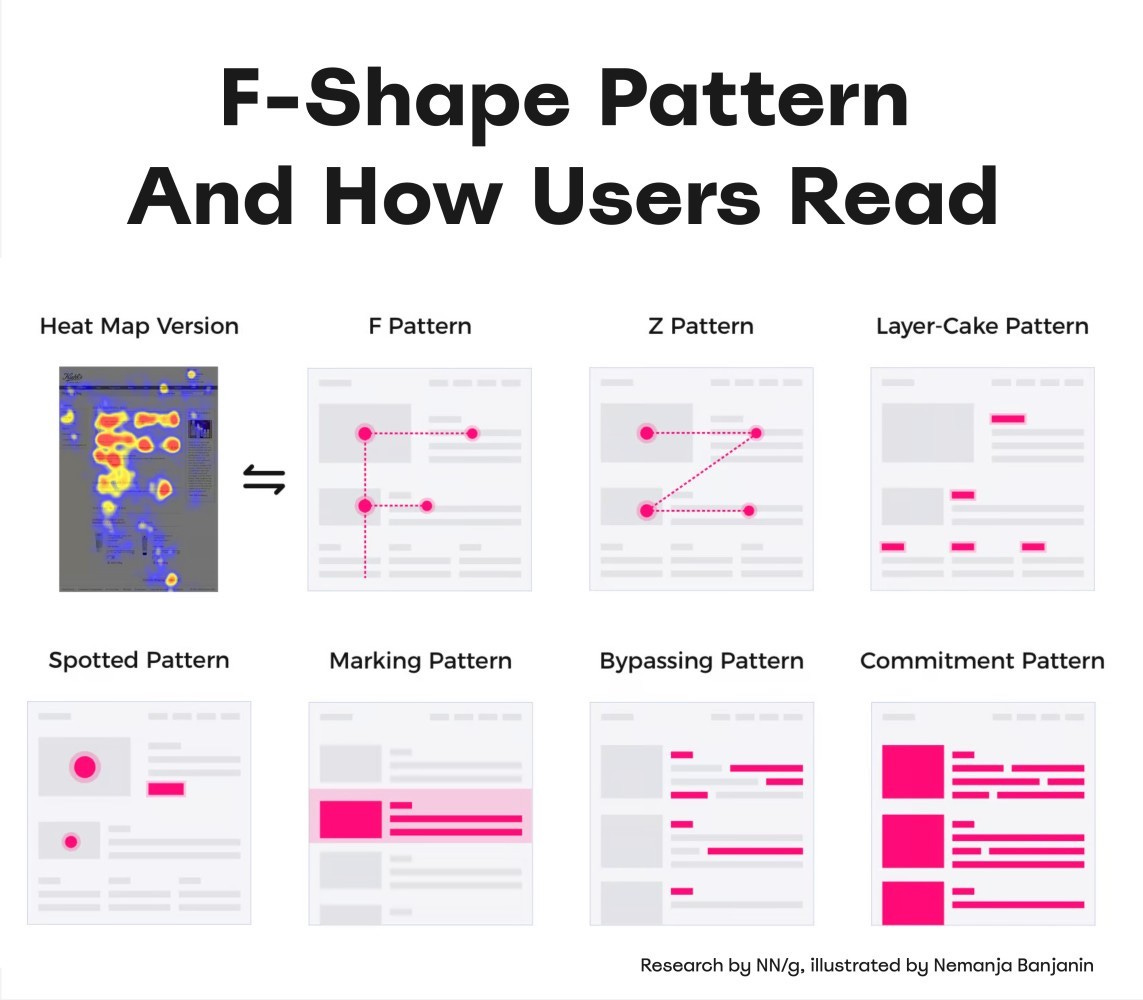
The reality is that people only scroll down emails and webpages if they have a reason to.
The Nielsen Norman Group (NN/g) has insightful research on this scrolling behavior:
The Hidden Cost of Context Blindness
When we ignore reading context, here’s what actually happens in schools:
The Permission Slip Panic
Field trip tomorrow. Permission slip attached as PDF. Parents can’t open PDFs easily on phones. Frantic morning scramble for paper copies.
The Schedule Change Confusion
Complex schedule changes presented in a table. Looks perfect on desktop. Completely unreadable on phones. Parents show up at wrong times.
The Policy Update That Nobody Read
New homework policy explained in detail—in paragraph eight of a dense email. Mobile readers never scroll that far. Teachers field questions all semester.
The Board Meeting Mystery
Important board documents attached as multi-tab spreadsheets. Board members trying to review on iPads during commute. They arrive unprepared, meeting runs long, decisions delayed.
The Mobile-First Method That Works
Here’s a systematic approach that ensures your communications work everywhere:
The Progressive Disclosure Pattern
Think of your message like an accordion, not a novel:
Line 1: The absolute essential (what/when/action needed)
Lines 2-5: Critical context (why it matters, who’s affected)
Lines 6-15: Supporting details (how it works, what to expect)
Link to more: Complete information (full policy, detailed instructions)
Each level works independently. Readers can stop anywhere and still have something useful.
The Thumb-Friendly Format
Design for one-handed phone use:
Links and buttons: Minimum 44x44 pixel tap targets
Line length: 50-60 characters maximum
Paragraph length: 2-3 lines on mobile (about 50 words)
Spacing: 1.5x line height minimum
Font size: 16px minimum for body text
The Scan-and-Go Structure
Mobile readers scan in an F-pattern. Put critical information:
In the first two words of headlines
At the beginning of paragraphs
In short, bulleted lists (not long sentences)
Before any “Read more” links
Context-Aware Templates You Can Use
The Emergency Alert Formula
WHAT: Snow day - School closed
WHEN: Tomorrow, Tuesday Dec 5
ACTION: No action needed

Details at: [school website]
Questions: [phone number]
The Event Announcement Structure
Science Fair - Thursday, March 10, 6 PM

WHERE: Main Gym
WHO: Grades 3-5
BRING: Your curiosity!

[REGISTER HERE - big button]

Full details: [link]
The Policy Update Framework
NEW: Homework Policy Starting Jan 8

KEY CHANGE:
Max 10 minutes per grade level

MEANS FOR YOU:
- Grade 3: 30 min max
- Grade 4: 40 min max
- Grade 5: 50 min max

Full policy: [link]
Questions? Reply to this email
Your Move This Week
Take your most important regular communication—the one that absolutely cannot be misunderstood.
Monday: Write it as you normally would.
Tuesday: Apply the progressive disclosure pattern. Rewrite with mobile line lengths.
Wednesday: Test on three devices in realistic conditions (standing, one-handed, distracted).
Thursday: Revise based on what failed during testing.
Friday: Send it and track questions. I guarantee you’ll get fewer confused responses.
What’s Coming Next
The Words That Work
You’ve built visual hierarchy. You understand context. But what about the words themselves?
Next week, we tackle plain language—how to write so clearly that comprehension becomes automatic, regardless of reading level or native language.
The complete Design for Clarity mini-course—with video walkthroughs, interactive templates, before/after libraries, and implementation tools—will be available at the end of this series for those who want the full system.
Your Experience
I’d love to know if this resonates with you. Reply with your context test results. What surprised you? What are you changing immediately?
I read every message—sometimes on my phone while walking my dog! 🙃
Systematically yours,
G

About the Author:
G (short for Gitane) is co-founder and Chief Creative Officer at EKG Collective, helping international schools turn communication complexity into systematic clarity. Learn more at ekgcollective.com.