

11: The Communication Network You Can't See
Design for Clarity (part 5 of 5)

🎧 Prefer Audio?
Here’s a human-recorded audio version with Chief Voice Officer Kirk McDavitt. Hit play, or keep reading below.
Where We Are
If I asked to see your school’s communication system, you would invariably show me an Org Chart.
You’d show me tidy boxes and straight lines. The Principal connects to the Assistant Principal. The AP connects to the Department Heads. The Heads connect to the Teachers.
It looks logical. It looks organized.
It is also a lie.
That chart shows who reports to whom. It does not show who talks to whom.
Real schools don’t operate on reporting lines. They operate on conversations.
The Grade 3 teacher doesn’t ask the network manager for IT help; they ask the tech-savvy teacher next door.
Parents don’t check your website for updates; they check the WhatsApp group run by that one influential dad.
New staff don’t read the handbook; they ask the person sitting at the desk across from them.
Over the last four weeks, we’ve learned to design clear messages (emails, newsletters, policies). But even the perfect artifact fails if it travels down a broken road.
Today, in the final piece of this clarity puzzle, we zoom out, because crafting the message is only one part of a bigger system.
The Shift: From Broadcast to Network
We tend to think of school communication as a broadcast:
I speak ➔ You listen.
But effective communication is actually a network:
I signal ➔ You receive ➔ You interpret ➔ You act.
When we treat communication as a broadcast, we obsess over our output. Did I hit send? Was the grammar correct?
When we treat it as a network, we obsess over the connection. Did it reach the right node? Did it trigger the right response? And if it failed—where did the breakdown happen?
To answer these questions, we need a holistic view of the entire system. That’s where Network Mapping comes in, a human-centered systems thinking tool that reveals not just where information goes, but where it gets stuck, distorted, or lost entirely.
Seeing the Invisible: Two Examples of a Broken Map
A network map is a diagnostic tool. It shows the difference between how you think your system works and how it actually works. You plot the official channels alongside the real ones. You trace where information should flow versus where it actually travels. And most importantly, you identify the gaps—the missing handoffs, the competing messages, the nodes that exist in your head but not in practice.
Let me show you what this looks like in action, with two communication breakdowns I’ve personally seen in schools.
Example 1: The Admissions Handoff Failure
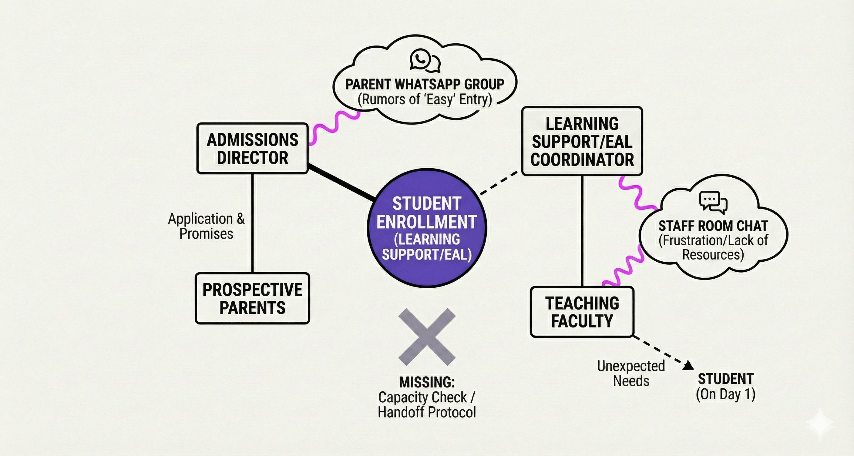
This map visualizes the “Day One Ambush.”
The Admissions Director is busy managing applications and making promises to prospective parents. The Learning Support/EAL Coordinator is fielding unexpected needs from teaching faculty who suddenly have a student requiring resources they weren’t told about. Meanwhile, rumors about “easy entry” are circulating in parent WhatsApp groups.
The problem? These two people are working hard, but they’re working in silos. The crucial Capacity Check—the moment where they talk before an offer is made—is missing entirely. There’s no handoff protocol between the person making enrollment promises and the person who has to deliver on them.
What happens? A student arrives on Day One with learning support needs that blindsided the school. Parents feel misled. Staff feel under-resourced and frustrated. And the unofficial channels—those WhatsApp groups—are now shaping the school’s reputation more than any official communication ever could.
Example 2: The Drop-Off Mess
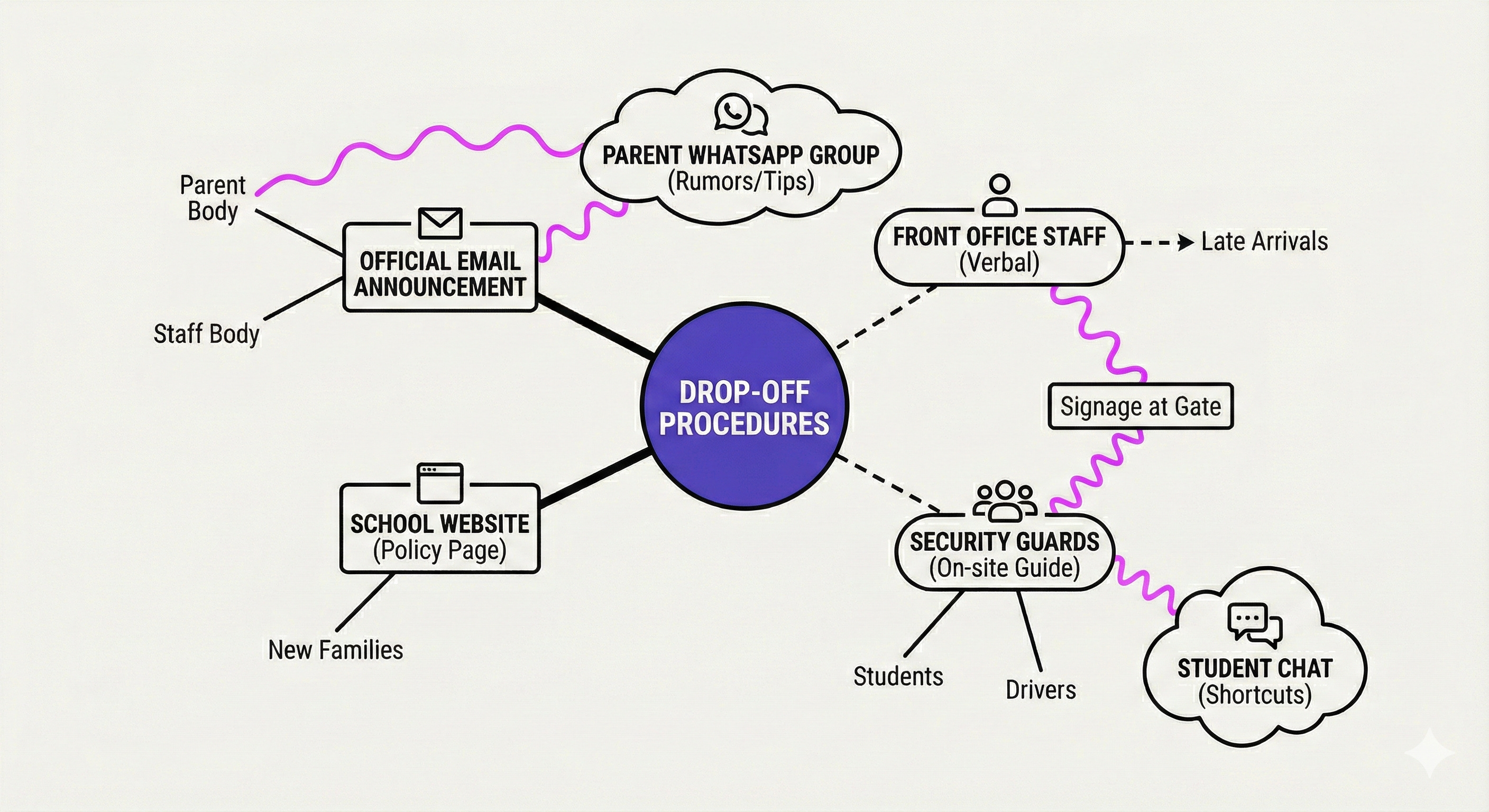
This map shows what happens when official policy meets reality.
The school sends a clear email announcement to the Parent Body and Staff Body about the updated drop-off procedures. They update the School Website with a dedicated policy page for new families. It’s all very official, very organized.
But on the ground? Completely different story. Front Office staff are giving verbal instructions to parents who arrive late. Security Guards are directing drivers with on-site guidance that may or may not match the email. Students are sharing shortcuts in their own chat groups. And the Parent WhatsApp Group is buzzing with rumors and tips that contradict the signage at the gate.
The official channels—email, website, formal announcements—are competing with the unofficial ones. And they’re losing. Because when people need information right now, they don’t check the policy page. They ask the person standing in front of them or check the group chat.
So What Do We Do About It?
These maps reveal a hard truth: you can’t fix a broken network by writing a better email.
The Drop-Off Mess isn’t solved by clearer language in the announcement. The Admissions Handoff Failure isn’t solved by better formatting in the handbook.
They’re solved by designing the connections themselves—by mapping where information actually travels, identifying the missing handoffs, and building the pathways that close the gaps.
This is what the last five weeks have been building toward. Not just better messages. Better systems.
The Grand Unification: Your Design System
Think of your school communication like a Subway System—but instead of trains and tracks, you’re designing information networks.
To get a passenger (your reader) from Point A (confusion) to Point B (action), you need five distinct elements working in harmony:
1. The Foundation: Design Principles (Week 1)
This is the Station Architecture. Proximity, Alignment, and White Space ensure the environment is navigable, not chaotic. If the station is a mess, people turn around before they even enter.
2. The Signage: Visual Hierarchy (Week 2)
This is the Wayfinding. Bold headlines and clear zones tell the passenger exactly where to look. Without it, they stand on the platform, lost in the noise.
3. The Experience: Context Awareness (Week 3)
This is the Train Design. Is it built for the rush hour commute (mobile/distracted)? If you force a desktop experience on a mobile passenger, they can’t board the train.
4. The Announcement: Plain Language (Week 4)
This is the Speaker System. Is the voice muffled and bureaucratic (”Please be advised regarding concomitant delays”), or is it crisp and clear (”Train delayed 5 minutes”)?
5. The Map: Network Thinking (Week 5)
This is the Track Layout. It ensures the stations actually connect. If there is no track between Admissions and Learning Support, the train derails.
If you miss any one of these, the passenger gets lost—not because they’re not paying attention, but because the system failed them.
That’s what those network maps revealed. The breakdowns weren’t about lazy staff or uninformed parents. They were about system design failures. Missing nodes. Competing channels. Broken handoffs.
But systems can be redesigned.
The New Standard: You Are an Architect
We started this series because you were tired of repeating yourself. You were tired of sending emails that felt like shouting into a void.
The solution isn’t to shout louder. It’s to design better.
You’re not just writing emails anymore. You’re building the pathways that make communication work.
You use Principles to build structure.
You use Hierarchy to signal importance.
You use Context to respect reality.
You use Plain Language to include everyone.
You use Network Thinking to connect the people.
When you do this, you aren’t just communicating information. You are building trust. And trust is the only platform that can support the weight of what we do in schools.
So there you have it: you’ve learned to see the invisible. Now it’s time to build something better.
Your Final Design for Clarity Toolkit (Coming in January)
I want you to leave this series with a complete toolkit.
That’s why I’m compiling every checklist, principle, and template from the past five weeks—plus video walkthroughs—into a comprehensive Design for Clarity Course.
It will be available mid-January, right after I emerge from a short hibernation.
After five weeks of dissecting internal communications and mapping invisible networks, I’m taking my own advice and creating some serious white space on my calendar. I’m taking a break to recharge, redesign, and possibly relearn how to speak without using the word “hierarchy.” 🙃
Details January 14.
Want Help Mapping Your Network?
Network mapping is something I do as a consultant—I come into your school, interview people across departments, and map the connections that should exist but don’t.
Sometimes the clearest view comes from outside the system.
Until Then
I want to leave you with a quote recently attributed to Charles Eames (of the famous Eames lounge chairs and thousands of other life-changing designs). When asked about who we design for, he said:
“You design for someone you love, and it can be you.”
When you design a clear email, you are showing appreciation to your community by respecting their time.
When you design a clear system, you are showing appreciation to your future self by reducing the chaos.
Thank you for reading, for caring, and for doing the hard work of making complexity clear. Here’s wishing you and yours joyful and connection-filled holidays ahead. 🕯️✨
Systematically (and seasonally) yours,

About the Author:
G (short for Gitane) is co-founder and Chief Creative Officer at EKG Collective, helping international schools turn communication complexity into systematic clarity. Learn more at ekgcollective.com.
Brilliant breakdown of how communication actually operates versus how we design it. The missing handoff protocols in both examples realy highlight thatmost "people problems" are actually system design failures. What strikes me is how treating informal channels like WhatsApp as competitors instead of legitimate nodes keeps them chaotic, when mapping them into the official flow could turn scattered chatter into structured signal.