


Where We Are
Think of the last time you followed a recipe on a screen. You probably found a list of ingredients at the top and the method underneath. If you were lucky, the platform also allowed you to switch between imperial and metric or scale the portions.
I bet you have a clear image of that layout in your mind’s eye, as it could not be more standard. It is rare for any recipe creator to stray from it.
An engineer named Michael Chu broke the mold, and what he came up with is a small stroke of genius. Today, let’s take a look at what his approach can teach us about the school procedures we write down, for colleagues, for students, and for parents.
Where It Came From
I was recently reminded of Chu’s method by a viral LinkedIn post from Dave Chapman. It dawned on me, yet again, how much a layout can do for a piece of information.
Chu became known for publishing recipes in a different shape on his Cooking for Engineers website, which he has run since June 2004 for anyone with “an analytical mind who likes to cook.”
You may have seen one of these recipes in your feed. If nothing else, you’d recognize the style immediately.

The ingredients stack in a column on the left. Each action gets a block to the right, reaching down only as far as the ingredients it touches. The blocks run left to right in the order you’d do them. One glance tells you pretty much all you need to know to follow the instructions.
A block only has room for a word or two, so the language stays plain by design. Pair that with a clear, uncluttered layout, and you get, you know, what you’d expect if visual design and plain language had a baby. A bit like a spreadsheet, but you do not need an analytical eye to use it. You just follow it.

Where We Are Going
Now think of how most schools write down a procedure.
The numbered steps live in one place, and all the things those steps depend on (the forms, the trackers, the approvals, the contact lists…) live somewhere else entirely. It’s the traditional recipe convention, with the ingredients kept in a completely separate tab. That is, when they’re not simply living in someone’s memory…
So the reader is left carrying all the cognitive load, and that’s when you get seventeen replies asking you to clarify something that seemed so perfectly clear on the page.
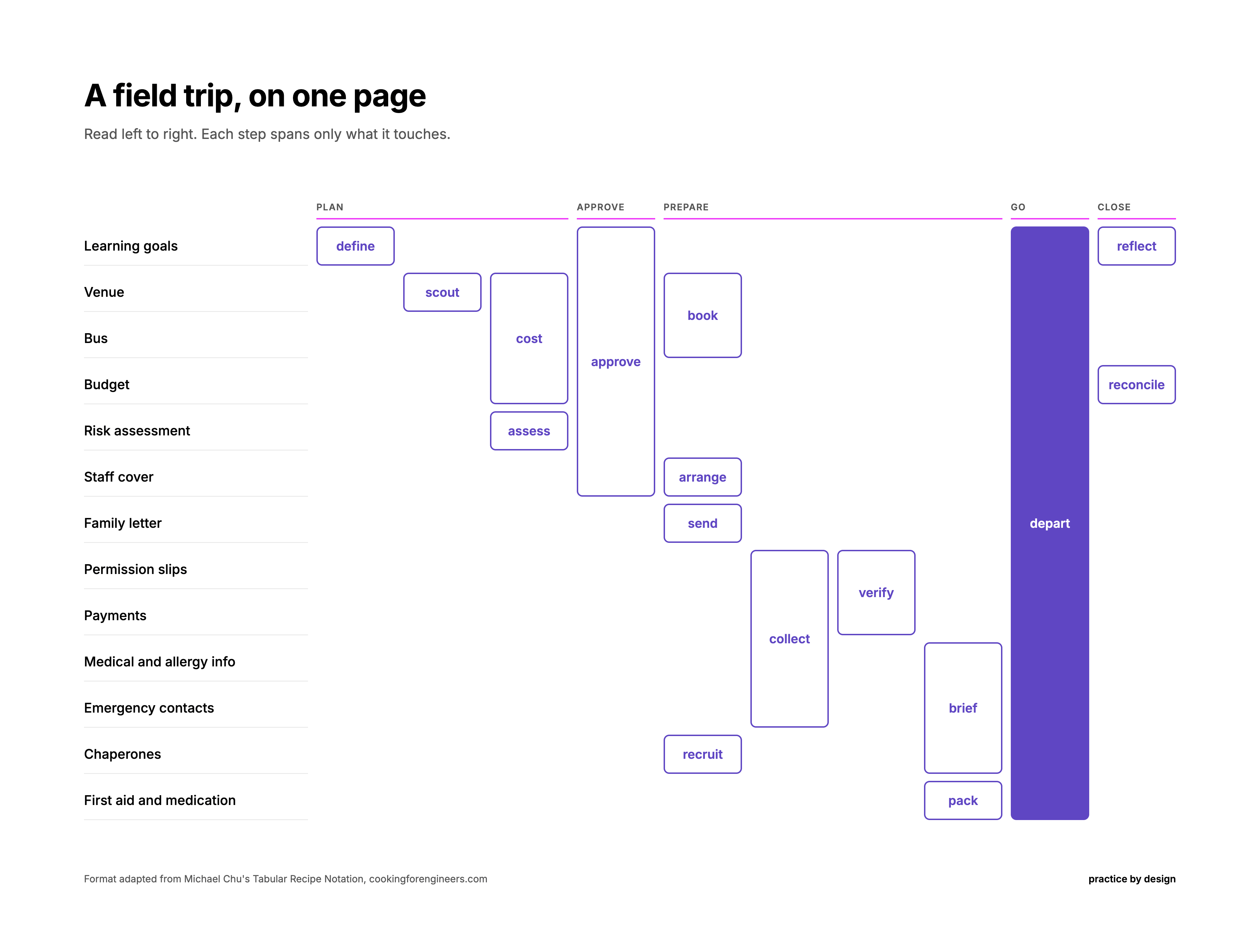
Chu’s logic works remarkably well here. Swap the ingredients for whatever a procedure needs, and you have a grid any school can use:
Rows are the inputs: the forms, people, approvals, and files
Columns run left to right, appearing as required by the “ingredients”
Each step is a block that stretches only across the rows it touches.
A Visual Example: Field Trip Procedure Grid
How to read it
Start at the top left and move right. It always starts with the learning goals (or it should), and everything else traces back to them. Each block is one step, and it stretches across only the item it touches.
What it does well
You can clearly see the sequence, the dependencies, and the full scope on one page. If you’ve ever seen a Gantt chart or sketched a dependency map on a whiteboard, this will feel familiar. Like a Gantt chart, it moves left to right through time. Like a dependency map, it shows what has to be in place before the next step can start. It also makes it obvious what can happen at the same time, something that lists can only do by adding more words.
Where it falls short
The grid assumes that things happen in order, so it struggles with branches. “If it rains” or “if a family hasn’t signed the slip yet” would each need their own note. It also doesn’t show who owns each block, or how long it takes. And yes, all of these things could be fixed with a digital layout and links, but then that adds a new layer of complexity that not every school is willing to take on (and own).
Why This Works
I know. Looking at that grid, part of you is thinking “it’s one more thing to make, for a process that already has a perfectly acceptable document.”
It’s a completely fair assessment. But look at how we treat learning. We would never accept a single way for a student to show what they know. We offer essays and presentations, then we assess them using quizzes and projects, because the same understanding shows up differently in different people. Universal Design for Learning calls this multiple means of representation. We call it good teaching.
The information we hand our colleagues and families deserves the same courtesy. The procedure document, with its multiple pages, can stay. The grid simply adds another possibility. Some people will prefer one over the other, but, in the end, plenty will use both: the grid to get the bearings, and the full document to check the detail.
And no, not every procedure needs one. Start with the one that generates the most repeat questions. Build the grid from the information you already have. You’ll be effectively rearranging what already exists so more people can use it.
This week’s move
Pick the procedure that generates the most questions. Then:
List everything it needs down the left column
Write the steps across the top as single verbs, in order
Stretch each step across only the rows it touches.
AI can easily do this for you. Paste your existing procedure into any tool with this prompt:
I’m going to share a procedure from my school. Turn it into a process grid, a format adapted from Michael Chu’s Tabular Recipe Notation (cookingforengineers.com).
How the grid works:
It reads like a cross between a Gantt chart and a dependency map.
Inputs run down the left column: every form, person, approval, file or resource the procedure needs.
Each column to the right is one step, written as a single verb (collect, verify, brief), in the order it happens. Time moves left to right.
Each step is a merged cell that spans only the inputs it acts on. When a step combines several inputs, its cell stretches across all of them.
Steps that can happen at the same time sit in the same column, stacked.
The goal: anyone can find their place by its position on the page, see what depends on what, and see what can run in parallel, without reading paragraphs.
Your task:
List the inputs, ordered so that every step’s inputs sit in adjacent rows. Reorder as often as needed to make that work.
List the steps as single verbs in time order, grouping parallel steps into the same column.
Build the grid as an HTML table, using rowspan for the merged cells. Also give me a plain list of each step and the rows it spans, so I can rebuild it in Google Sheets or Excel.
Then flag, in a short list:
any input no step touches (a candidate to stop collecting)
any step that touches inputs owned by different people or teams (a handoff to watch)
any part of the procedure that branches (”if this, then that”), which the grid can’t show well. Suggest a one-line note for each.
Rules:
Use only what’s in my procedure. If a step or input seems to be missing, ask me instead of inventing it.
Keep step labels to one or two words.
If there are more than about 15 inputs or 10 steps, suggest how to split it into two grids.
Here is the procedure: [paste it here]
Then hand the grid to someone who has never done the task, and watch how they use it. I bet you’ll have some very happy campers.
Systematically yours,

About the Author:
G (short for Gitane) is co-founder and Chief Creative Officer at EKG Collective, helping international schools turn communication complexity into systematic clarity. Learn more at ekgcollective.com.