


Last week, I spent three days at Finalsite University Lisbon, where I joined communications and admissions colleagues from all over, South America to Australia.
If you haven’t come across them, Finalsite is a company that builds digital tools for schools and colleges, including websites, mobile apps, and enrollment management systems. Many independent and international schools rely on their platform, which explains the crowd.
As you’d expect from a vendor conference, there were product demos, but also a good number of sessions dedicated to hot topics in schools today: improving Search Engine Optimization (SEO) for AI search, social media, and even deepfakes, because, well, they’re out there and could land in an office near you without advance notice.
But something from the very first talk in the auditorium set the tone for everything that followed, and got me thinking about all of you, my practice by design readers.
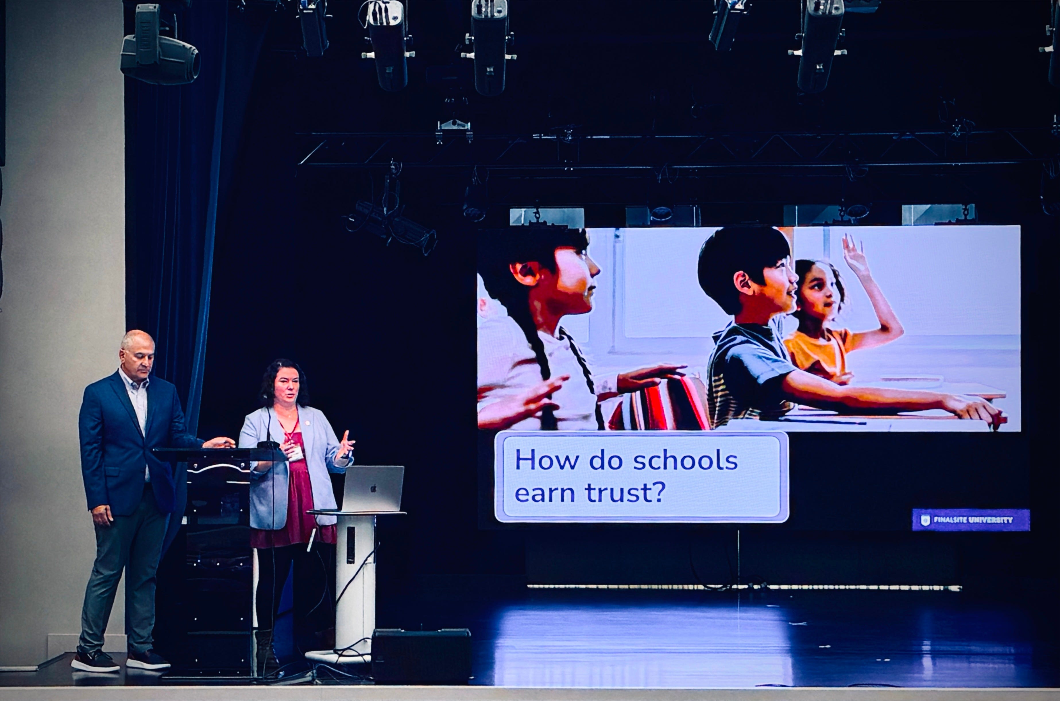
How do schools earn trust?
According to the folks at Finalsite, the answer is refreshingly unglamorous: trust is earned through small moments and attention to detail. This, in fact, is a theme that runs through much of what they offer, the idea that every click, form, and message adds up, and that people judge those moments by what they experience rather than by what the institution intended.
It dawned on me that the same concept applies to every tool a school brings in, regardless of who builds it. A platform always looks its best on stage, or during a demo presentation where someone handles all the controls without hesitation. Meanwhile, a parent meets that same tool on a cracked phone, at the end of a long day, or in between meetings, trying to submit that short survey or sign a permission slip before moving on to the next thing.
Don’t get me wrong: closing the gap between the demo and everyday use is something good vendors care about, too, but much of it comes down to how we, as schools, evaluate and set up what we buy.

Where We Are
If you’ve been reading practice by design, or following my work for a while, it won’t surprise you that this is one side of school I care deeply about.
At my last school, among other major tech implementation projects, I facilitated a two-year process to replace our secondary learning management system, a decision that affected more than 500 students, their families, and 80 faculty. The decision-making process alone took an entire year.
Over those months, we did a bit of everything: interviews and brainstorming with students, teachers, and parents, personas and empathy maps of each group’s frustrations, and a process map showing every tool a student touched in a typical week. All of it helped us understand the problem (if it interests you, I wrote up the full case study walking through each of these steps).
But what finally moved the needle for our leadership team was a set of screen recordings of students going about an ordinary day, navigating a handful of tools to do simple things, from checking their schedule to opening and submitting an assignment. While each one of those systems did its job, the number of clicks, tabs, and tools required to complete one basic task was frustrating to watch, and it was eating into learning time.
What that process taught me is that the most useful habit in experience design is also the simplest one: watching real people try to get real things done, noticing where they hesitate, and treating every hesitation as information about the system rather than a shortcoming of the person.
It may sound like specialist work, but in my experience, most of it fits comfortably into a school leader’s week, with tools you already use.
Where We’re Going
Four methods to evaluate any school system for usability
You won’t need a budget, a new platform, or a consultant for any of the methods I am about to share (though I’d be happy to be an external set of eyeballs for your experiments).
These all pay off quickly and give you a clear glimpse into the complexity (or lack thereof, if you’re lucky) of your systems.
How to Get There
Walk the path yourself (15 minutes). Grab your phone, log in with a parent or student test account, and try three of the jobs your families and students do most often. That could be finding the lunch menu, reporting an absence, accessing a school resource, or searching the handbook for the uniform policy. Count your clicks and jot down every moment you hesitate or have to guess.
Watch instead of asking (about an hour). Surveys tell you how people feel about a system, while watching shows you what happens when they use it. Sit with five people, one at a time, and give each of them a task. Ask them to think out loud as they go, while you stay quiet and take notes. Nielsen Norman Group’s research found that testing with about five users uncovers most usability problems, so you can learn a great deal without running a big study. If finding a time to sit together is tricky, ask them to screen-record the task instead.
Count the touchpoints (20 minutes). A touchpoint is any moment when someone interacts with your school: an email they receive, a form they fill out, a login screen, a text from the school’s lunch provider, a portal notification. Each one on its own seems harmless, but families experience them all together, and the total is often far bigger than anyone inside the school realizes. This is a great way to turn a vague sense of frustration into evidence that you can bring to a leadership meeting. A few questions I like to start with are:
- How many passwords does a new family create in their first month?
- How many different senders email families during the first week of school?
- How many times do they type their child’s birthday across your systems?Diagnose the handoffs (30 minutes). So much of the friction lives in the spaces between systems, just as our students’ screen recordings showed. For one gap you’ve found, work through the following questions:
- Where does the user experience the gap, between which two systems, and at what moment?
- Who should own that handoff, meaning the experience between the systems rather than either system on its own?
- What would good look like if that handoff had been designed on purpose?
And then what?
You might be wondering: why would I open this can of worms if this is something our team won’t be able to fix in the short term? That’s a valid question. Some issues will come down to the platform’s own features, or a budget cycle, or even a decision made long before you arrived. But simply being aware of where families and students get stuck changes how you lead. It helps to shape the questions you ask the next time the school is considering a platform change, as well as how you word the next welcome email. It might even make you a little more patient the next time a parent calls the office for the third time in a week.
Because when people can see that someone is paying attention to those small moments, that’s when trust starts to build.
This Week’s Move
Block an hour on your calendar this week and try just one of the methods above. I promise it will give you a much clearer picture of what trust looks like from the other side of the screen.
Systematically yours,

P.S. The touchpoints and the handoff diagnostic come from a session I gave at the AAIE Global Leadership Conversation in Toronto this year. They came with two companion tools: the Family Journey Map that tracks every system a new family touches from enrollment to their first week of school, and the Experience Continuity Model, a three-step framework for mapping, diagnosing, and designing those handoffs. If you’d like either one of these, hit reply and I’ll send it your way.
About the Author:
G (short for Gitane) is co-founder and Chief Creative Officer at EKG Collective, helping international schools turn communication complexity into systematic clarity. Learn more at ekgcollective.com.